Case Study

Noohn

Noohn is a sustainable fashion brand. We built its identity, directed its photography and designed its website.
Client
Noohn
Industry
Fashion
Stage
Launch
Location
Oporto, Portugal
Years
2023
Built
Brand · Art Direction · Website
Website
[ Visit Website → ]
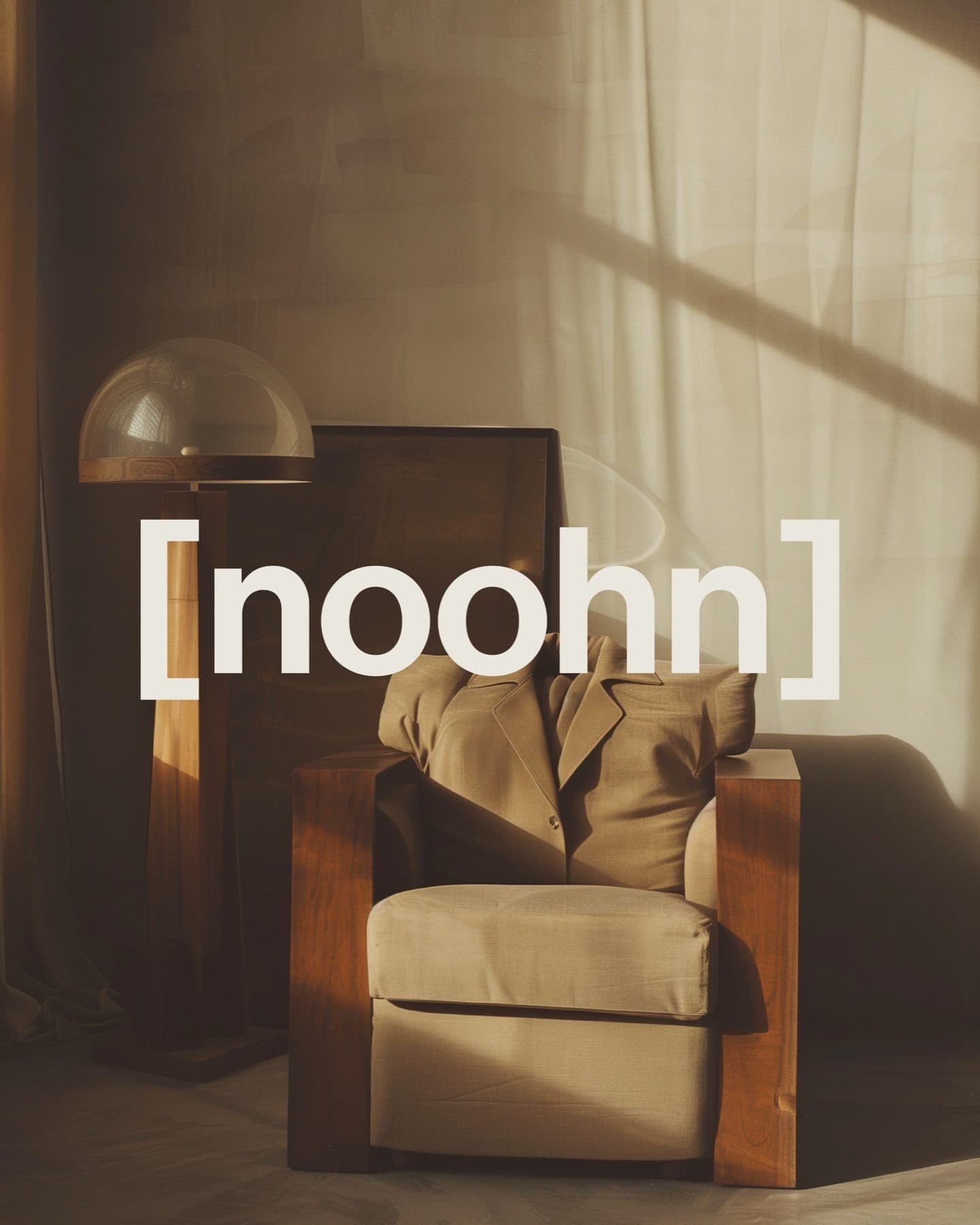
A cream armchair with a wooden frame beside a lamp in warm window light, with the noohn wordmark across the picture.

01 · The Result

A Brand Rooted InClarity And Restraint.

The identity is typographic and deconstructed, with neutral palettes. The website translates the brand's ethos into a digital experience of the same clarity.

02 · What They Asked For

A Brand ShapedBy Intention.

Noohn is a fashion brand built on visual identity, storytelling and sustainability. It is rooted in clarity, neutrality and timeless design, and each detail, from tone of voice to material choices, is meant to reflect a commitment to conscious fashion.
We created the full brand identity, directed the photography language and built a website. The brand is meant to be more than a label: a framework for how sustainable fashion can look, feel and communicate.

03 · What We Built, In Order

Identity, PhotographyAnd A Website.

The work covered the full brand identity, the direction of the photography language and the website.
  1. 01

    Brand Identity

    The black noohn wordmark centred on a warm off-white ground with thin vertical guide lines.

    The full identity, built on the wordmark and a neutral palette.

  2. 02

    Photography Direction

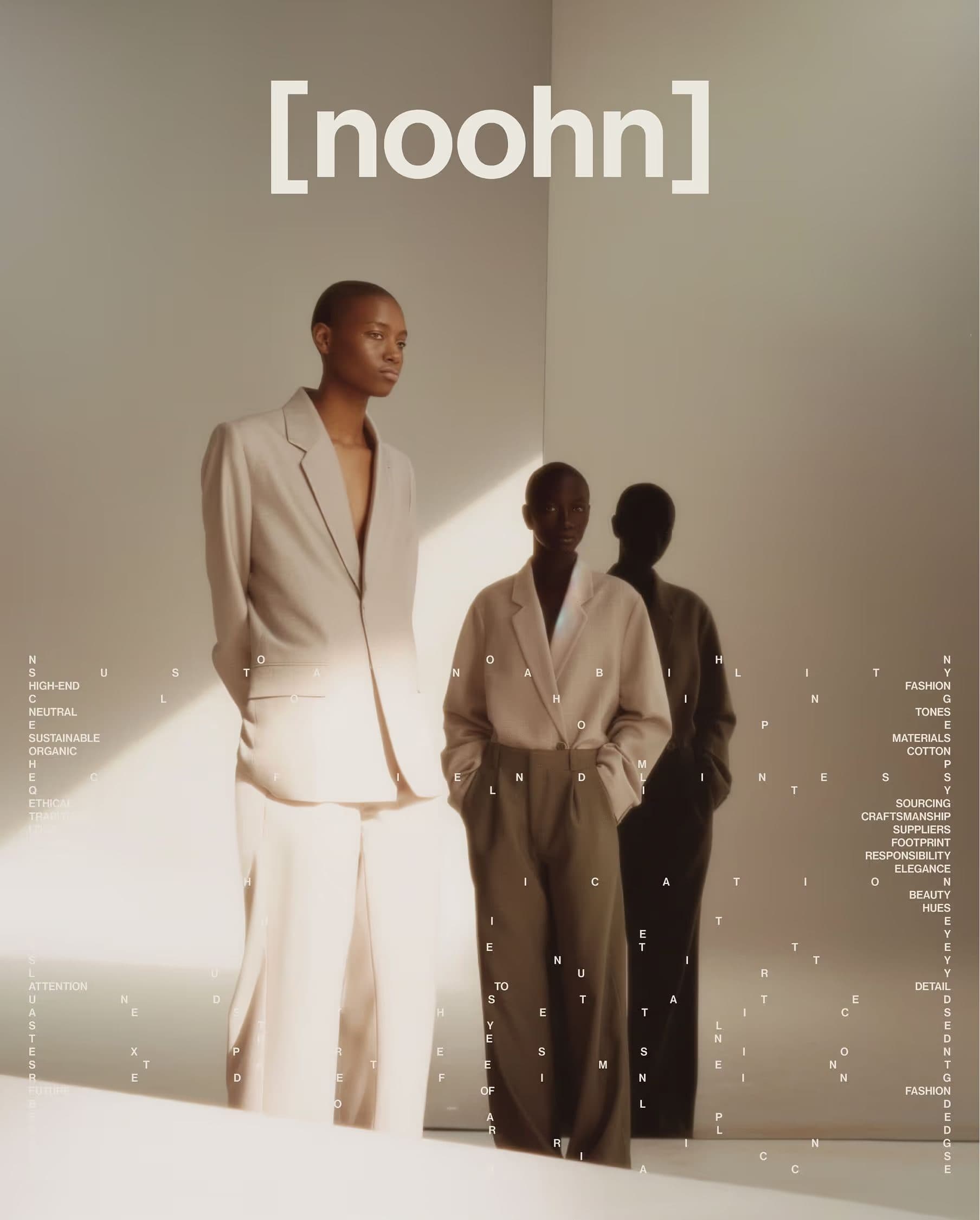
    Two people in cream and brown tailoring stand in warm light beside a shadow, with the noohn wordmark above.

    A photography language of neutral tailoring, soft light and quiet interiors.

  3. 03

    Website

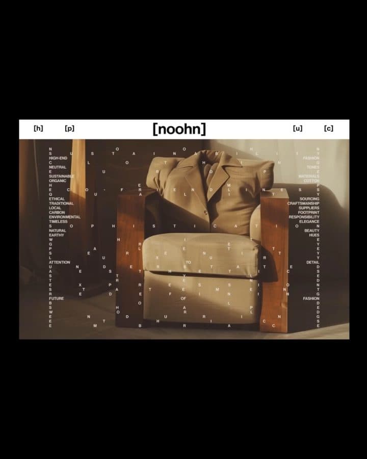
    A black page with a white navigation bar and the noohn wordmark over a picture of a cream armchair.

    A website that translates the brand's ethos into a digital experience rooted in clarity and restraint.

  4. 04

    Typographic System

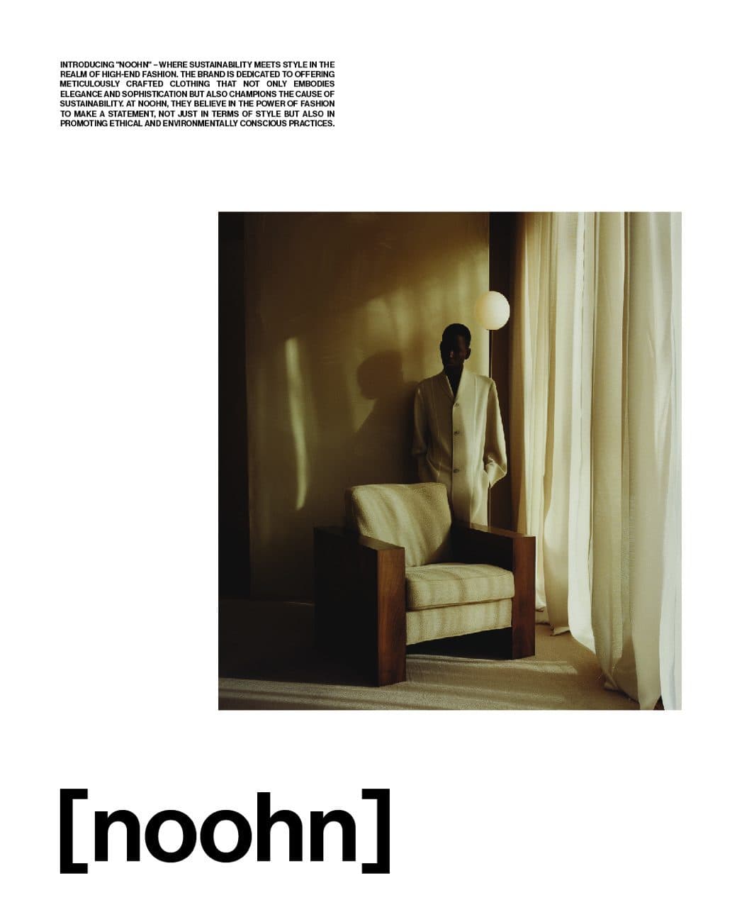
    A white page with a small block of text at the top, a square photograph of a cream armchair and the noohn wordmark below.

    Deconstructed, typographic layouts where text, picture and wordmark sit apart.
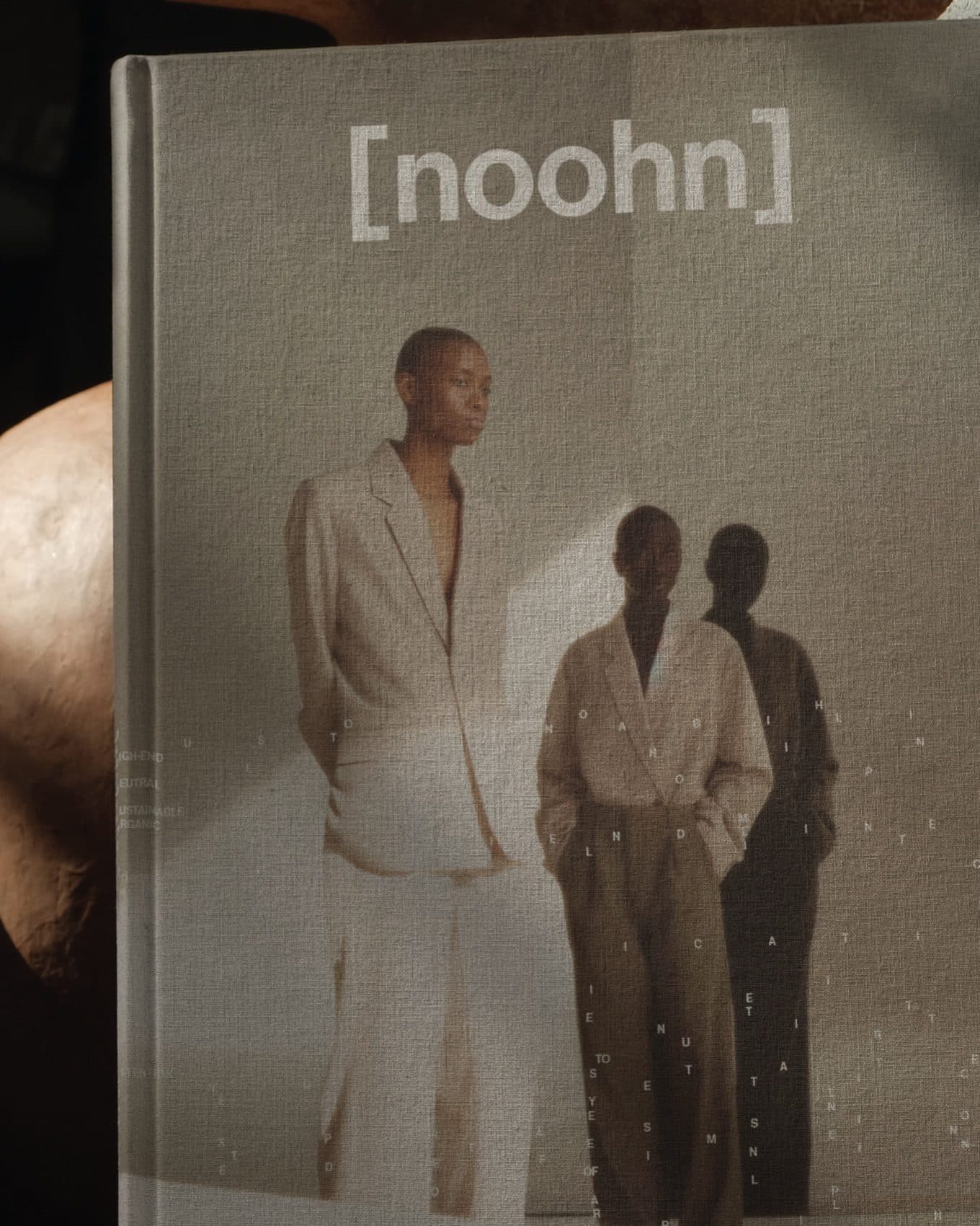
Two people in neutral tailoring beside a shadow, on the cover of a grey linen book marked noohn.

04 · The One Decision

Letterforms, ScatteredOn Purpose.

The identity is typographic and deconstructed. Scattered letterforms and neutral palettes stand for the brand's philosophy of breaking down traditional fashion systems.

  • A close crop of two people in beige and brown tailoring, with the noohn wordmark across the middle.
  • A frayed linen tag marked noohn on a black ground, tied with natural string.
  • A large cream letter n set in square brackets over a person in a cream jacket beside a wooden armchair.

05 · What This Taught Us

Restraint Is AlsoA Message.

Noohn's brand rests on clarity, neutrality and timeless design. That leaves little room to hide, so each choice, from the wordmark to the photography, has to agree with the rest.
When a brand promises intention, the identity, the images and the site have to make the same promise. Leave out what does not carry it.
An aerial view of a pale, cracked coastline meeting dark blue water, with faint tracks in the surf.

VC & Startups · Launch

Kestrel

An identity, an image system and a website for Kestrel Intelligence, an AI-driven intelligence platform.

View Case Study

Ready For The Next Stage?

Tell us where the business is and where you want it to go. The Growth Assessment is a short application, then a working session with the founders on what to build first.

  • For Businesses Planning Their Next Stage Of Growth
  • ≈ 2 Min Application
Book a Growth Assessment