Case Study

Meiso

Meiso treats coffee as a quiet ritual. We designed its identity, its packaging system and a website that carries the same pace.
Client
Meiso
Industry
Hospitality
Stage
Launch
Location
Tokyo, Japan
Years
2023
Built
Brand · Packaging · Website
Website
[ Visit Website → ]
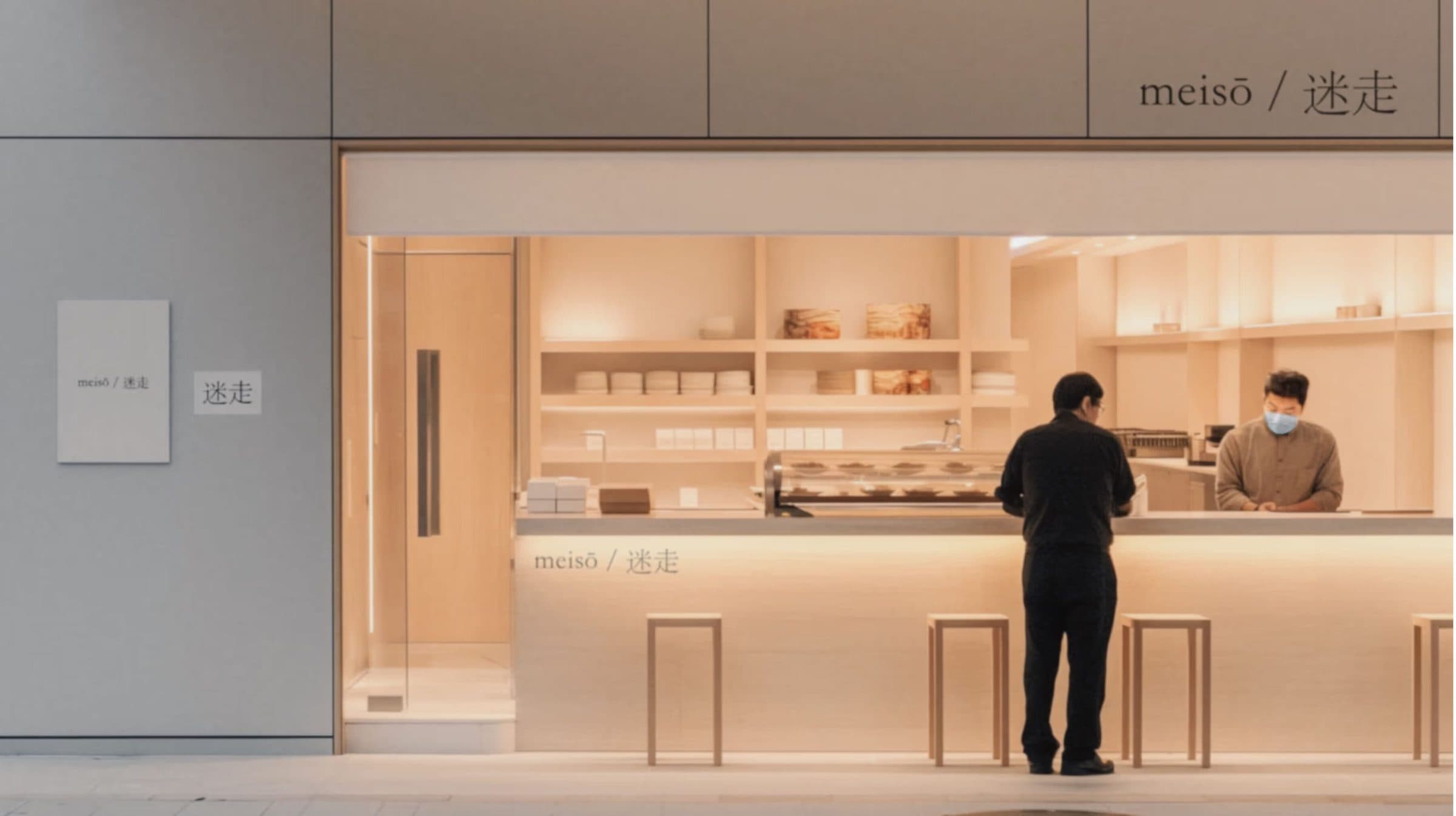
A warmly lit counter at the back of a pale room, with shelves of bread behind it and two people standing at it.
  • A print of a cookie on a spoon above a spoon of butter, laid over a cream card on black.
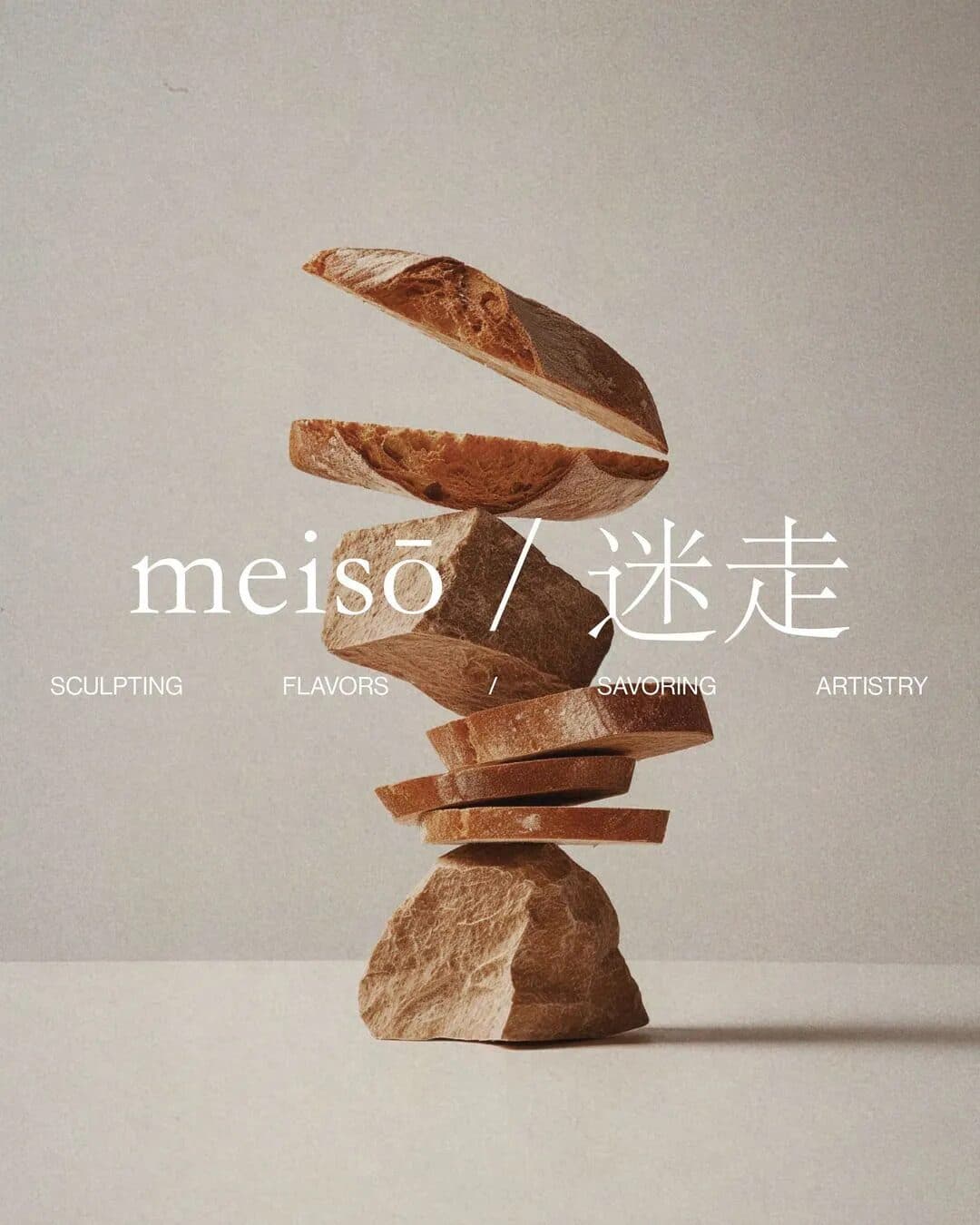
  • A print of sliced bread balanced on stones, laid over a cream card on black.
  • A print of a clay cup balanced on a stack of stones, next to a cream card on black.

01 · What They Asked For

A Coffee ShopBuilt Around A Ritual.

Meiso is an artisanal coffee shop in Tokyo. It presents coffee through sculptural forms, premium beans and Japanese-inspired minimalism. The name, meiso (迷走), points to thoughtful wandering and discovery in the craft.
They asked for a brand. We designed the identity, the packaging system and a website that carries the ritual of the Meiso experience through considered layout and tactile detail.
02 · What We Found

The Coffee Is A Ritual.The Brand Had To Feel Like One.

Meiso pays close attention to brewing, sourcing and presentation, and treats preparation and drinking as a meditative act. The identity needed the same quiet: sculptural, organic, unhurried.

03 · What We Built, In Order

Identity, Packaging,Then The Website.

One identity, built to work across the coffee touchpoints: bean sourcing, brewing and the retail space.
  1. 01

    Brand Identity

    Sliced bread stacked on a rough stone, with the meisō wordmark in white across the middle.

    The Latin name and 迷走 set together in a light serif, over sculptural stacks of bread and stone.

  2. 02

    Packaging System

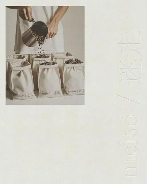
    Hands pouring coffee beans from a steel scoop into a row of cream cloth bags, beside a faint 迷走 mark.

    Cloth bean bags and printed cards in natural materials and earth tones.

  3. 03

    Website

    The meisō wordmark in large black serif type on a pale grey field.

    A website that carries the ritual through considered layout and tactile detail.

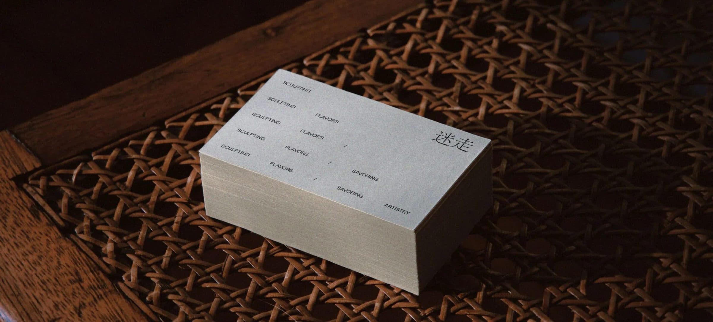
A stack of cream business cards resting on a dark, woven cane surface.

04 · The One Decision

Natural Materials,Warm Earth Tones.

Stone, bread and woven cane carry the identity in balanced compositions drawn from Japanese design principles. Warm earth tones link coffee cultivation, artisanal craft and a slower way to drink it.

05 · What This Taught Us

A Name CanSet The Brief.

Meiso points to thoughtful wandering. We took that as the pace of the identity: sculptural forms, natural materials and room around everything.
When a name carries a philosophy, the design has to carry it too. We read the name as the brief and let the materials do the rest.
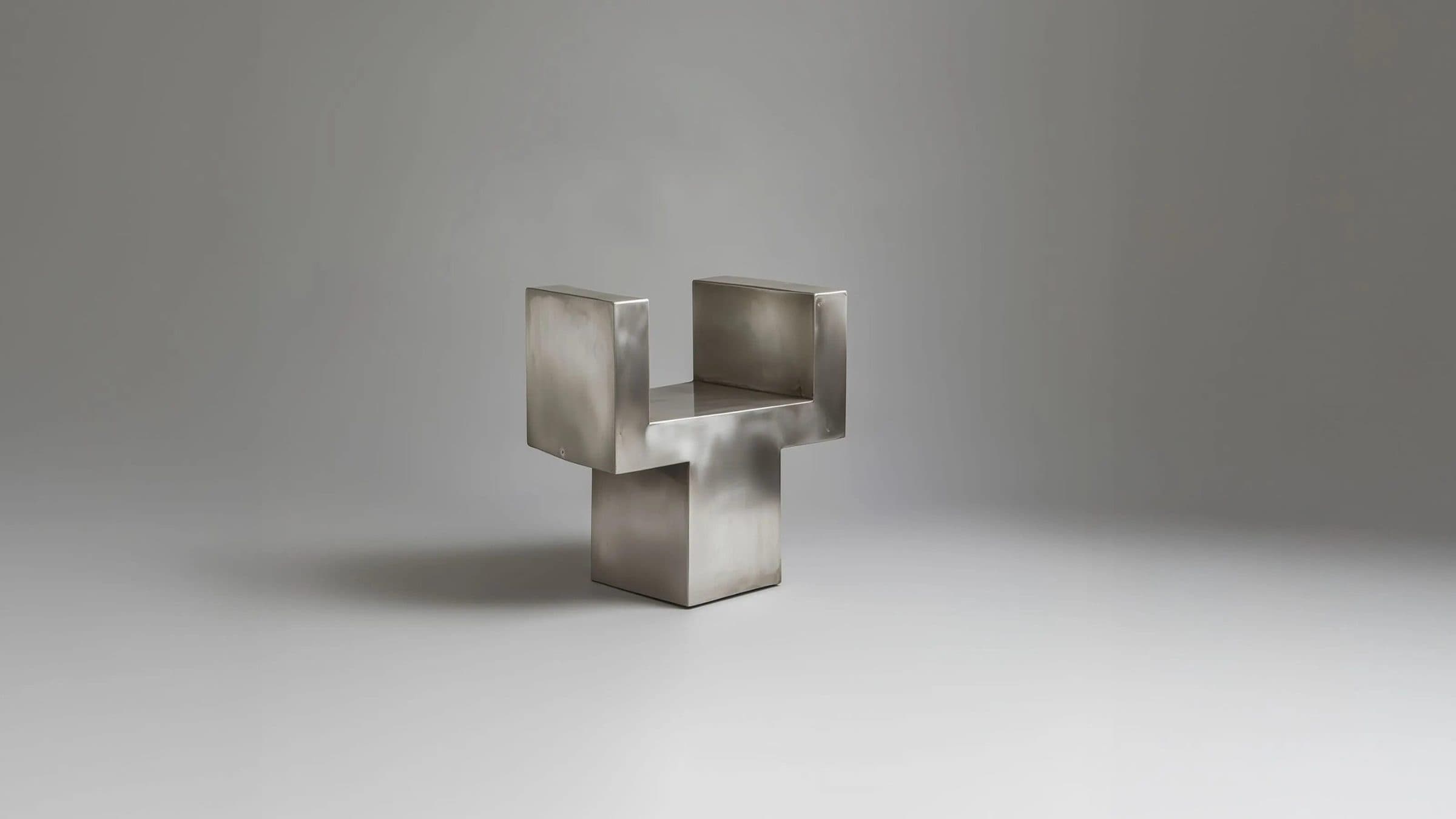
A small folded steel form standing on a pale grey surface against a soft grey wall.

Hospitality · Launch

Krome

A Darwin coffee shop gets a stark, monochrome identity: logo, type hierarchy and signage, plus a website.

View Case Study

Ready For The Next Stage?

Tell us where the business is and where you want it to go. The Growth Assessment is a short application, then a working session with the founders on what to build first.

  • For Businesses Planning Their Next Stage Of Growth
  • ≈ 2 Min Application
Book a Growth Assessment