Case Study

Krome

A specialty coffee shop in Darwin asked for a brand and a website. We gave it a stark identity and a website that keeps to it.
Client
Krome
Industry
Hospitality
Stage
Launch
Location
Darwin, Australia
Years
2023
Built
Brand · Website
Website
[ Visit Website → ]
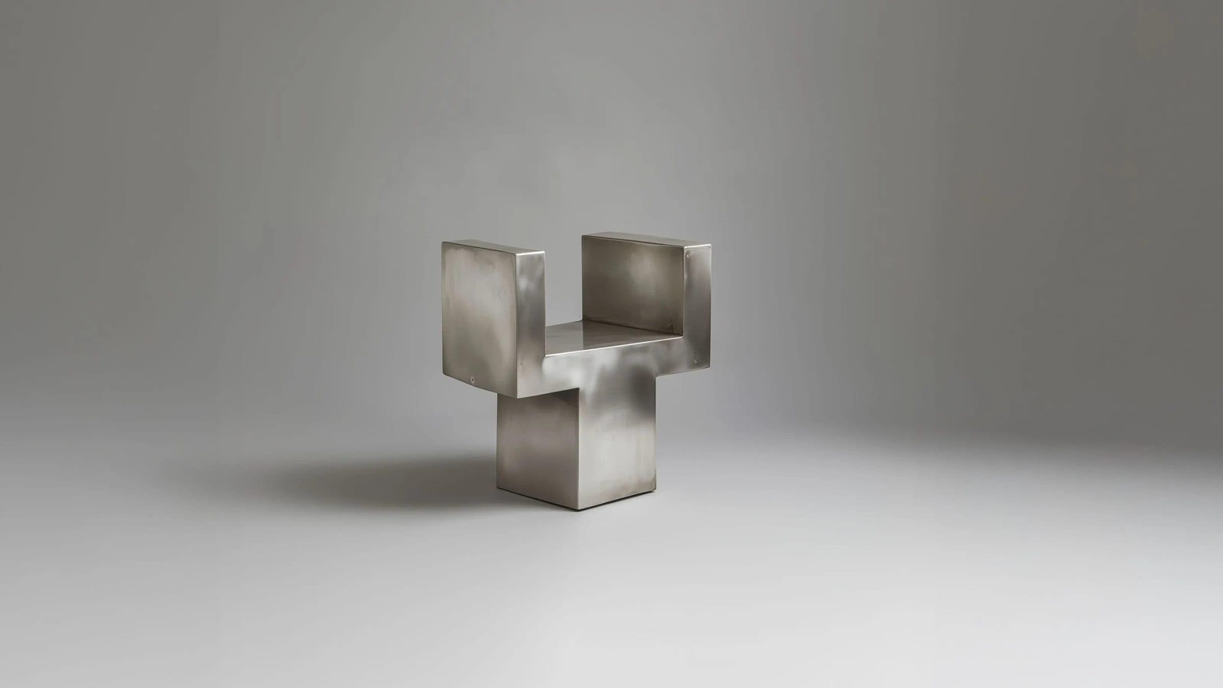
A small folded steel form standing on a pale grey surface against a soft grey wall.
  • The Krome wordmark set vertically in white over a deep blue field with faint construction lines.
  • An espresso machine cut from rough grey stone, pouring coffee into a steel mug with a blue dot.
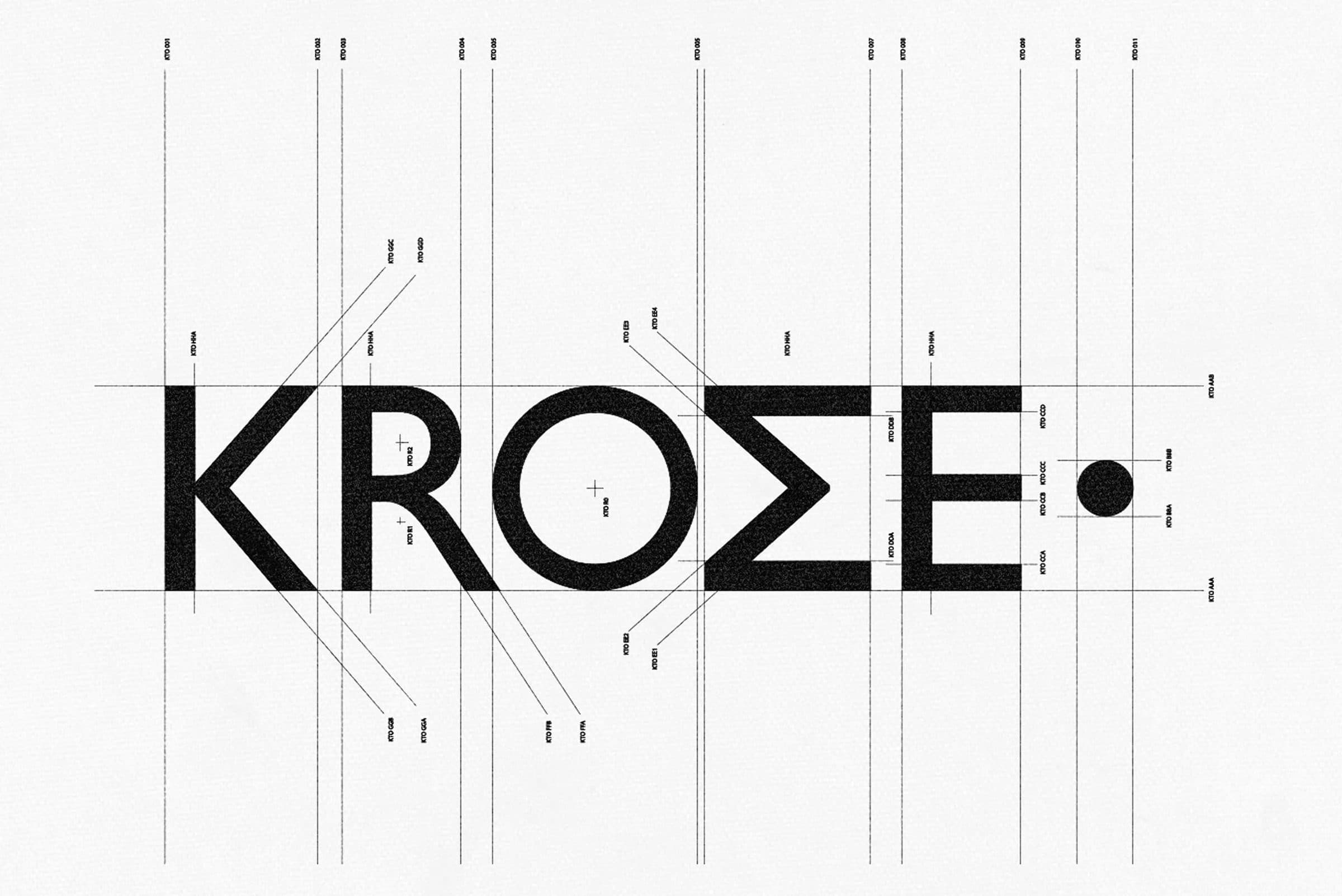
  • The Krome wordmark set vertically in black, drawn over a construction grid on white.
  • A folded Krome menu and a framed print on a saturated blue ground.

01 · What They Asked For

A Darwin Coffee ShopWith A Method.

Krome is a specialty coffee shop in Darwin, Australia. Its menu is seasonal and detailed: each item names where it comes from and how it is prepared, from sourdough dishes to selected coffee beans.
They asked for a brand and a website. We delivered the identity system, with the logo, the type hierarchy and the signage language, and a website that reflects the simplicity and discipline of the craft.

02 · What We Found

The Coffee Is Made By Method.The Brand Should Look Like It.

Krome brews systematically and pays close attention to detail. Its menu explains each cup and each plate. The identity had to show that precision and clarity before anyone read the menu.

03 · What We Built, In Order

An Identity System,Then A Website.

The identity came first. The website was designed to keep the same simplicity and discipline.
  1. 01

    Logo

    The Krome wordmark in black capitals, marked with construction lines on white.

    The Krome wordmark, set in bold capitals and shown on its construction grid.

  2. 02

    Type Hierarchy

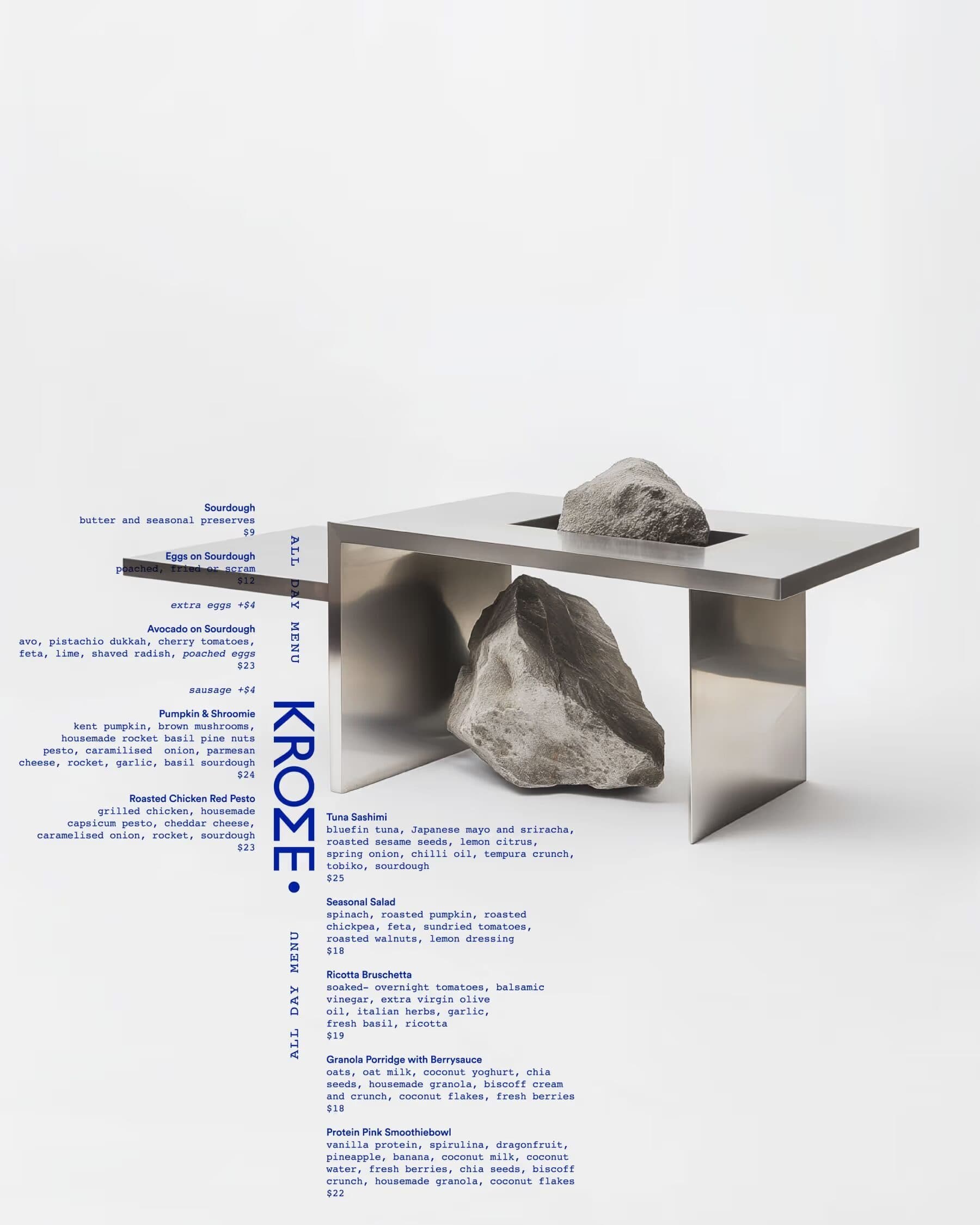
    A menu poster with small blue text and a vertical Krome wordmark beside a steel table holding a rock.

    The menu is set in a clear order, from the vertical wordmark down to the description of each dish.

  3. 03

    Brand In Use

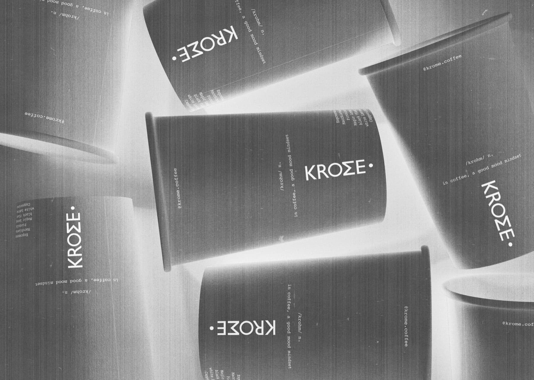
    Black paper cups printed with the Krome wordmark, scattered in grey tones.

    The wordmark and its type carried onto paper cups, in black and grey.
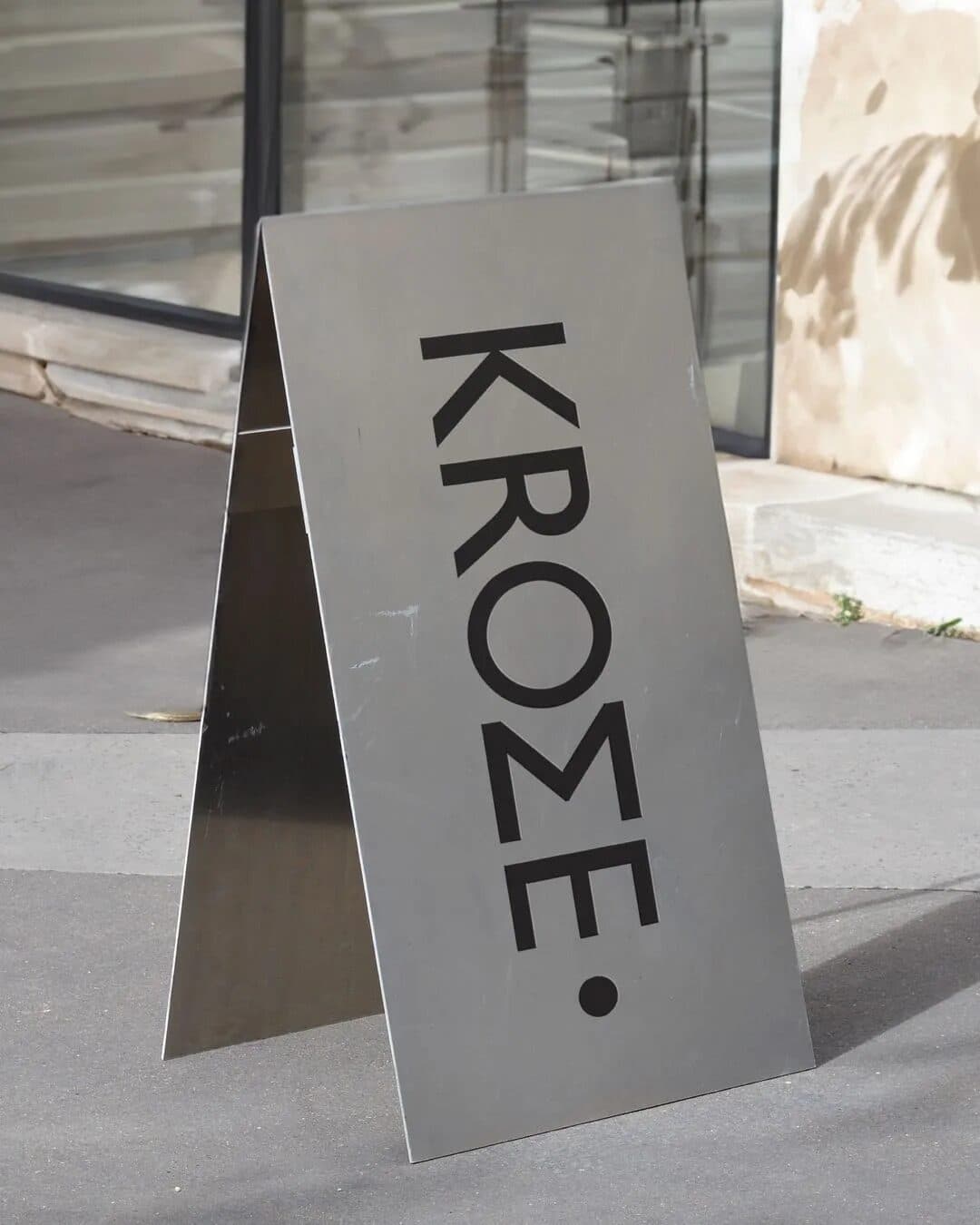
A steel A-frame sign with the Krome wordmark in black, standing on a pavement beside a glass shopfront.

04 · The One Decision

Stark, Bold,Monochrome.

Bold typography and a monochromatic palette carry the identity. Clean architectural elements tie the systematic brewing method to contemporary café culture.

05 · What This Taught Us

Discipline Is ADesign Choice.

Krome makes coffee by method, so we let the identity follow one. One palette, one bold typeface and few elements, all in the same order.
When a brand rests on a craft, the way it looks should be as controlled as the way it is made. Restraint tells the visitor that the same care sits in the cup.
The letters EKKE in pale type, split by the dark profile of a man's head against a pale grey wall.

Fashion · Launch

Ekke

A platform for contemporary Indian design. We built the brand identity and the website, and art directed the images.

View Case Study

Ready For The Next Stage?

Tell us where the business is and where you want it to go. The Growth Assessment is a short application, then a working session with the founders on what to build first.

  • For Businesses Planning Their Next Stage Of Growth
  • ≈ 2 Min Application
Book a Growth Assessment