Case Study

Matter Forms

Matter Forms turns oyster shell waste into an alternative to concrete. We gave the material a brand and a website.
Client
Matter Forms
Stage
Launch
Location
London, United Kingdom
Years
2024
Built
Brand · Website
Website
[ Visit Website → ]
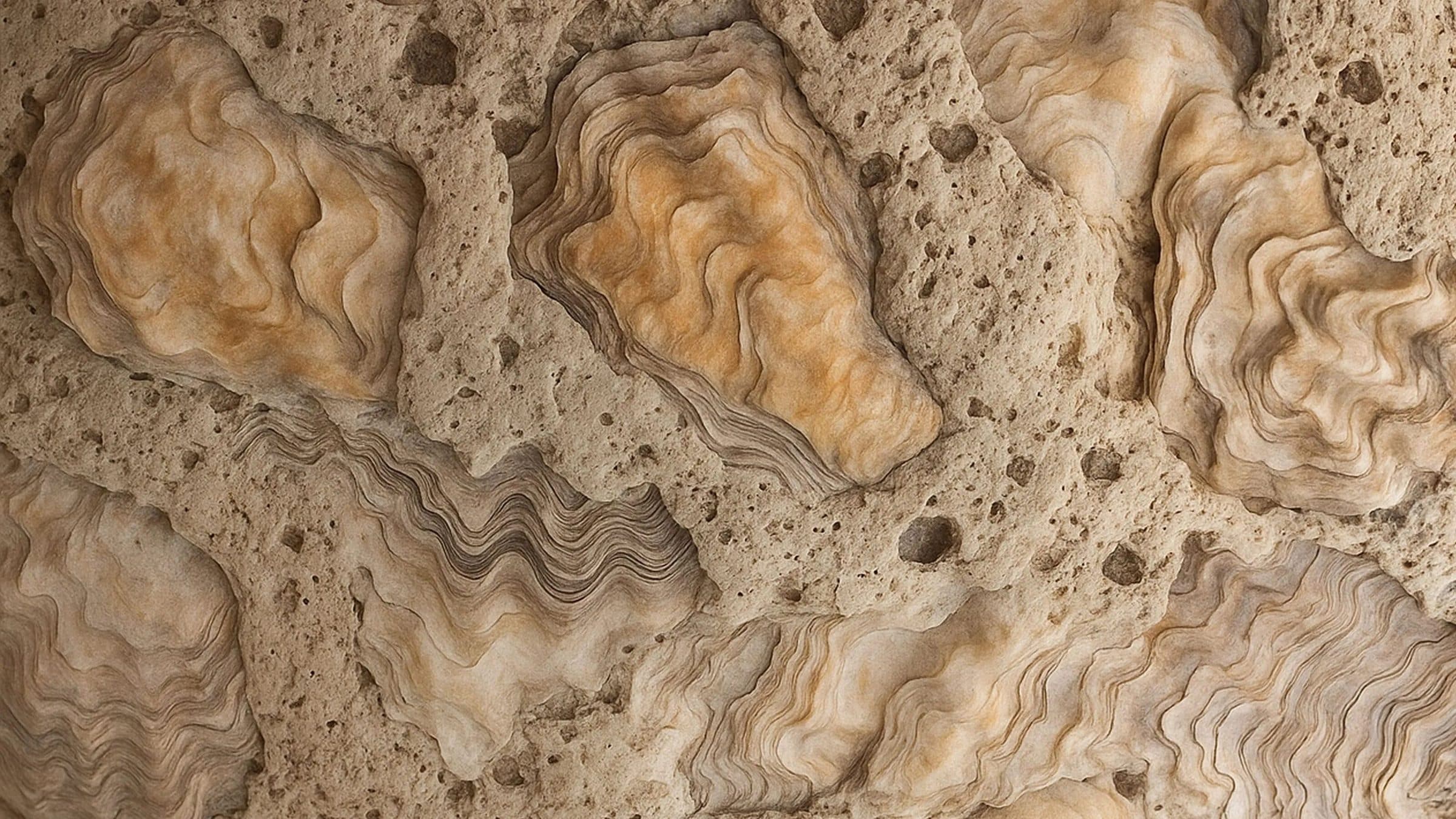
Oyster shells set into a sandy, porous surface, in orange, cream and brown tones.
  • Rounded black shapes with soft edges on a pale yellow field, with a thin circle outline.
  • Blurred black and pale green modular shapes on a pale yellow field.
  • A clay vase behind a small ceramic cup printed with the Matter Forms wordmark, on a dark teal ground.

01 · What They Asked For

A Design Collective,A New Material.

Matter Forms is a material-led, interdisciplinary design collective in London. It works on circular alternatives for the built environment. Its first material, Oyster[Crete], turns oyster shell waste into a bio-alternative to traditional concrete.
Oyster[Crete] suits small design pieces and large architectural applications. They asked for a brand and a website for it. We built the identity and the site.
  • A white Matter Forms envelope resting on a bed of oyster shells, in black and white.
  • Two dark forged knives and a fork lying across a pale, rough shell-like form.

02 · What We Found

A Waste Stream Became A Material.The Brand Had To Show Both.

Oyster[Crete] starts as shell waste and ends as a stand-in for concrete. The identity needed to carry the process and the potential in one system.

03 · What We Built, In Order

A Brand For The ProcessAnd The Potential.

An identity that gives the material a face, and a website that presents it.
  1. 01

    Brand Identity

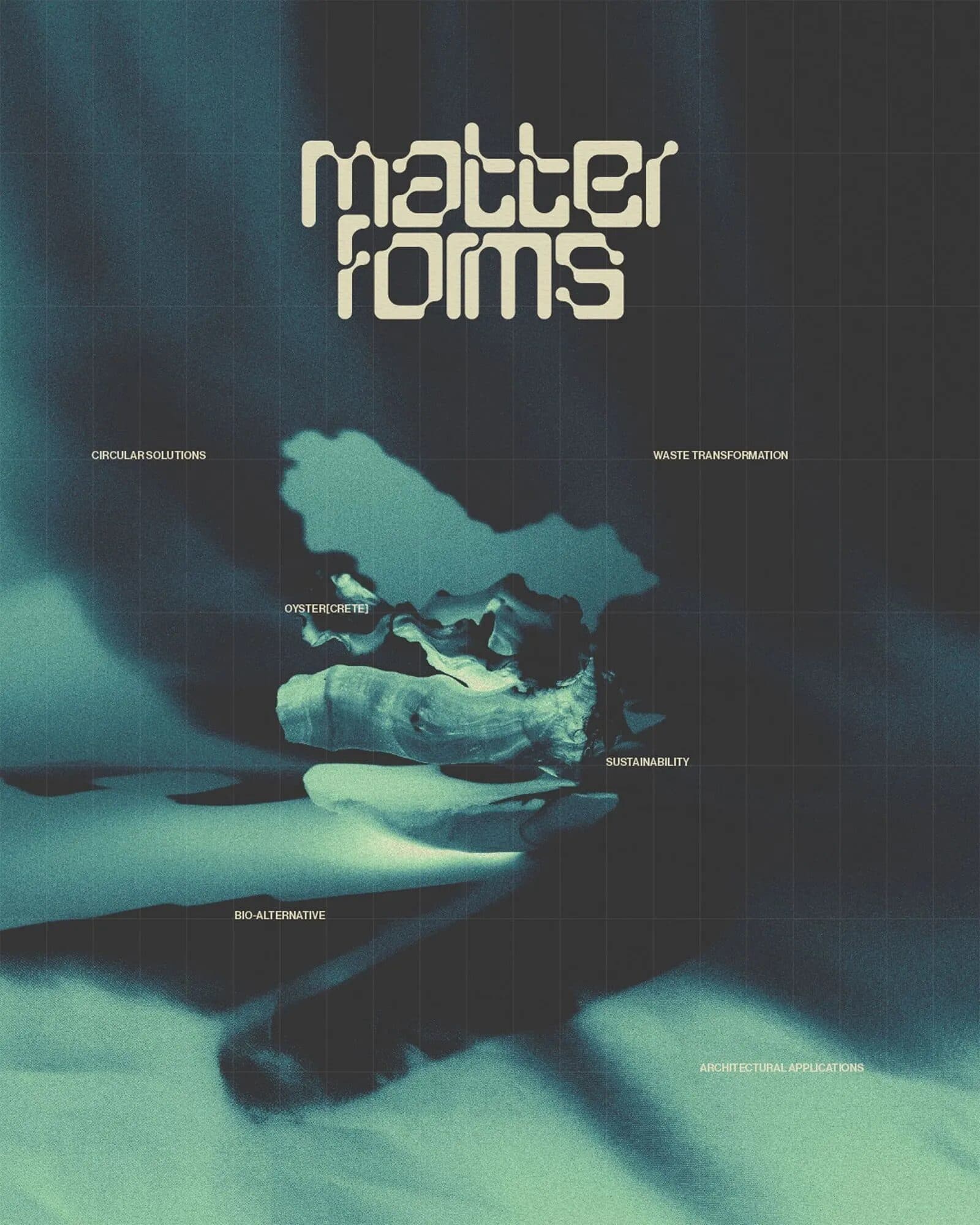
    A poster with the Matter Forms wordmark in cream at the top over a dark teal image of a shell, with small labels around it.

    The Matter Forms wordmark, set large over a teal-and-cream image of the material.

  2. 02

    Print

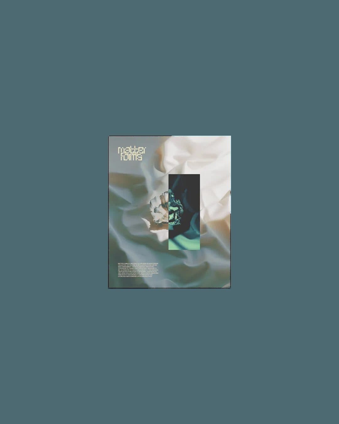
    A small printed card showing the Matter Forms wordmark and a teal image, on a blue-grey field.

    A printed piece that carries the same forms and the same elemental palette.

  3. 03

    The Material

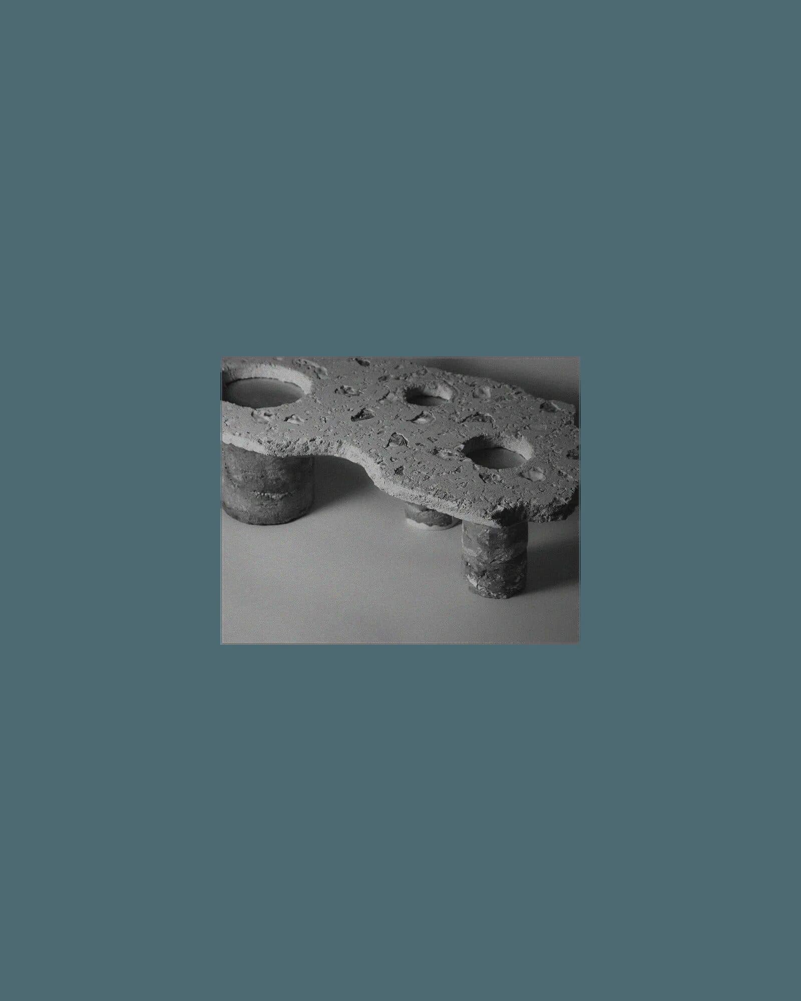
    A grey slab with rounded holes and short legs, photographed on a blue-grey field.

    Oyster[Crete], a bio-alternative to traditional concrete for small pieces and large architecture.
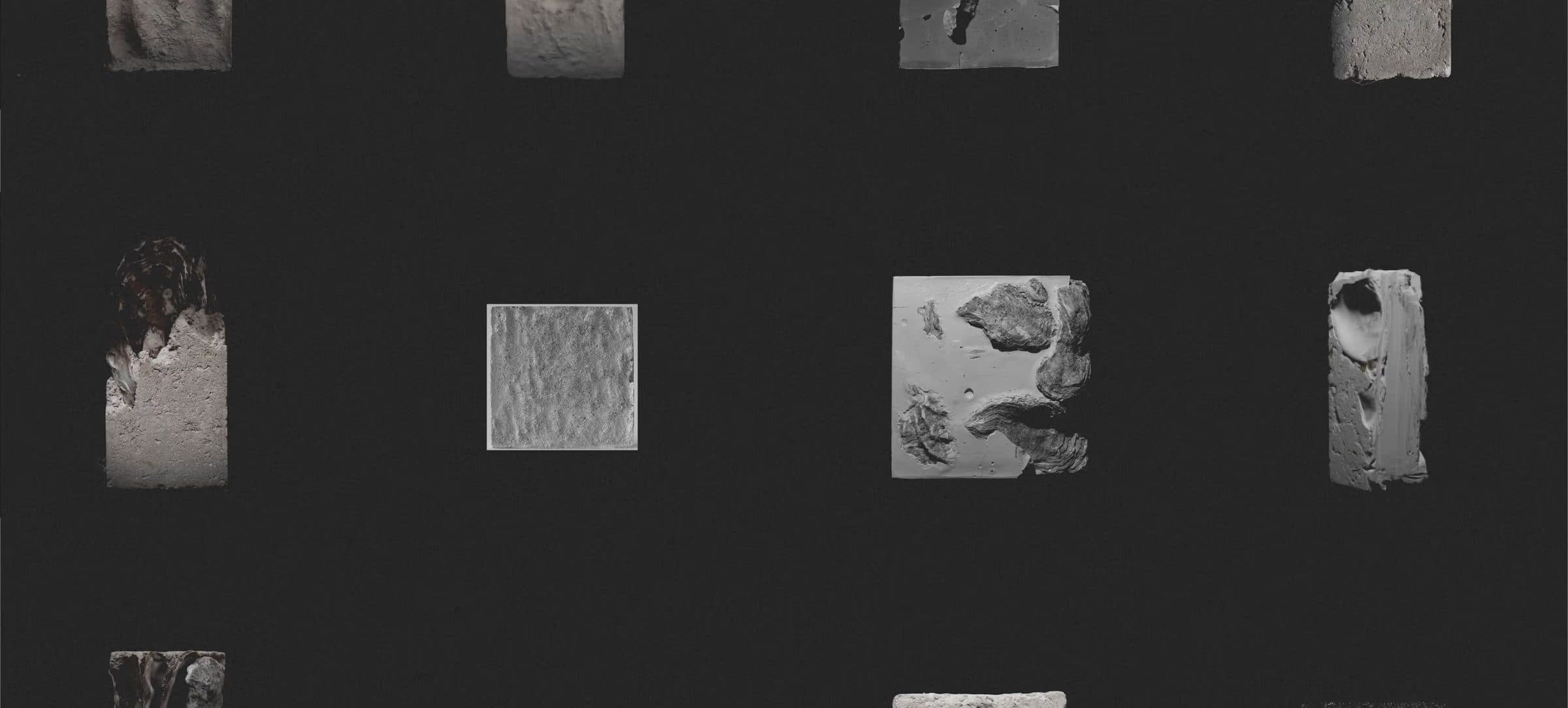
A grid of small material samples in pale stone and grey tones on a near-black ground.

04 · The One Decision

Forms LikeShell Erosion.

Modular forms, reminiscent of shell erosion and mineral formations, flow across the surfaces. A restrained, elemental palette ties the brand to earth and sea.

05 · What This Taught Us

Let The MaterialSet The Look.

The story here is the material: shell waste turned into something that stands in for concrete. The brand borrows its forms and its palette from that story.
When a product starts as a process, show the process. Erosion, mineral and sea: the identity says where the material comes from before it says what it does.
A model in a black lace-up top and a patterned skirt crouches against a burnt orange backdrop, looking over her shoulder.

Fashion · Launch

Arde

A bold identity, art directed photography and a website for a Bogotá brand named for fire.

View Case Study

Ready For The Next Stage?

Tell us where the business is and where you want it to go. The Growth Assessment is a short application, then a working session with the founders on what to build first.

  • For Businesses Planning Their Next Stage Of Growth
  • ≈ 2 Min Application
Book a Growth Assessment