Case Study

Arde

Arde is named for fire. We gave it a visual identity, art directed its photography and designed its website.

Client
Arde
Industry
Fashion
Stage
Launch
Location
Bogotá, Colombia
Years
2024
Built
Brand · Art Direction · Website
Website
[ Visit Website → ]
A model in a black lace-up top and a patterned skirt crouches against a burnt orange backdrop, looking over her shoulder.

01 · The Result

A Bold, SculpturalBrand Language.

The identity speaks in geometric forms. Light and shadow carry the photography. The website follows with the same weight.
  • A model in a long black dress bends forward to touch her shoe against a pale grey backdrop.
  • A model kneels in a dark red leather jacket and matching skirt, adjusting her belt.
  • A model stands in a long black sleeveless gown with one hand raised.
  • A model seen from the side in a white lace dress with a high slit and black knee-high boots.

02 · What They Asked For

A Name That MeansBurns.

Arde is a brand from Bogotá, Colombia. Its name is Spanish for burns or blazes. The brand describes its approach as passionate, built on craft and on the transformative power of fire.
The scope was a complete visual identity, art directed product photography and a website. Deliverables: a logo, a typography system, a colour palette and brand guidelines, plus a responsive website with collection pages and an editorial layout.
  • The arde, wordmark in orange above a large white comma-shaped mark on a pale grey grid.
  • A stack of paper printed with the arde, wordmark in a repeating pattern, on a grey surface.

03 · What We Built, In Order

Identity, PhotographyAnd A Website.

The work covered the visual identity, the direction of the product photography and the web experience.
  1. 01

    Visual Identity

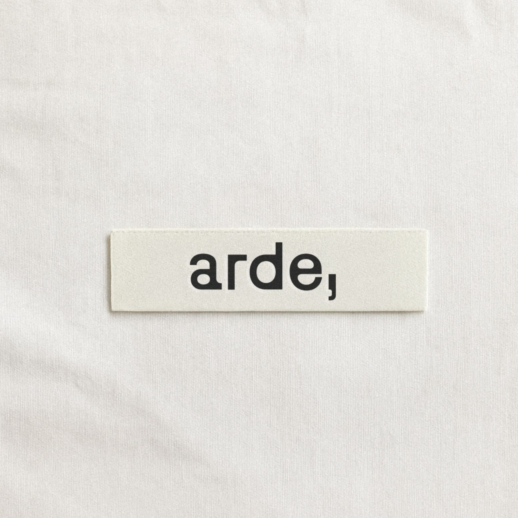
    A small cream woven label printed with arde, in black, on a fabric surface.

    The complete identity: a logo, a typography system and a colour palette.

  2. 02

    Art Direction

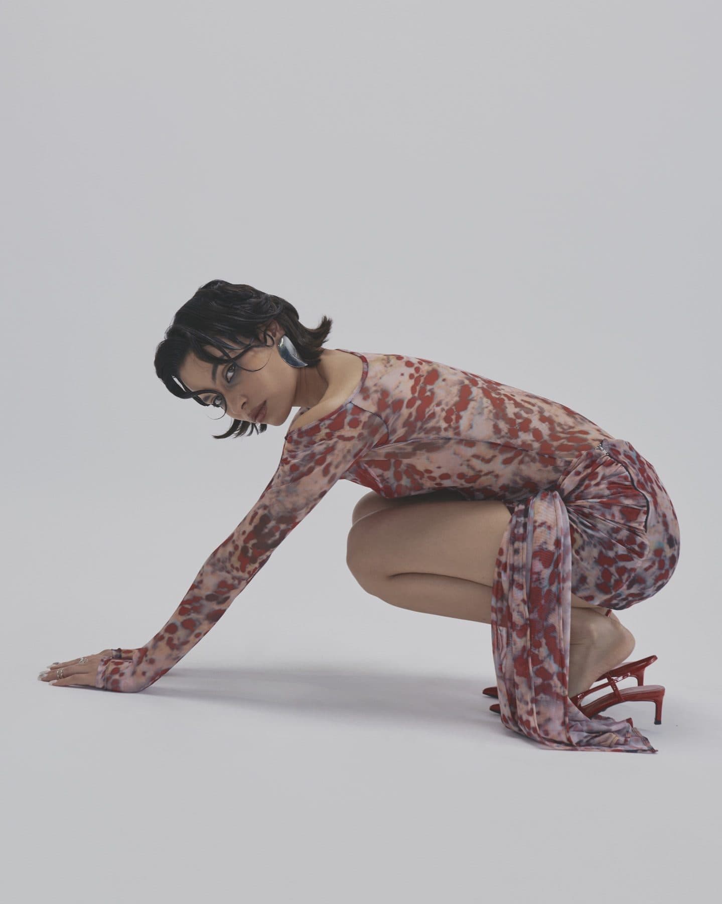
    A model in a patterned long-sleeved dress crouches with one hand on the floor against a pale grey backdrop.

    Direction for the product photography, shaped by the interplay of light and shadow.

  3. 03

    Website

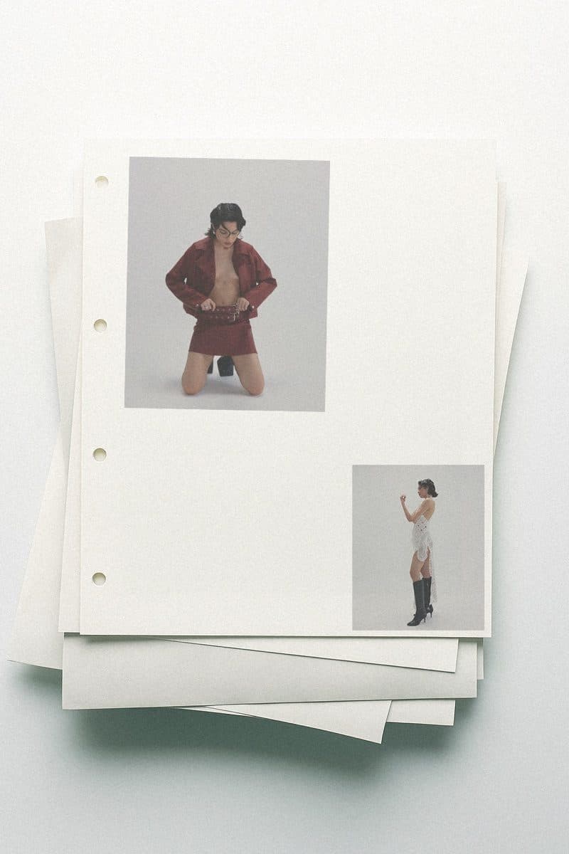
    Loose sheets stacked on a white surface, holding small photographs of two models in an editorial layout.

    A responsive website with collection pages and an editorial layout, made to carry the weight of the pieces.

  4. 04

    Brand Guidelines

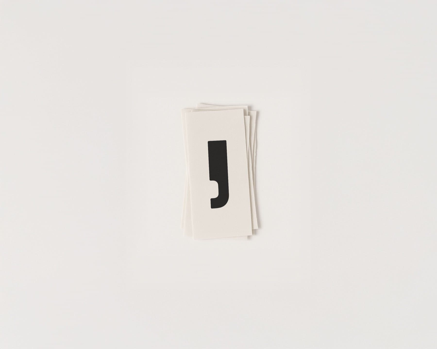
    A stack of small white cards printed with a black comma-shaped mark.

    Guidelines that keep the logo, typography and colour consistent.

  • A small photograph of a model in dark trousers, set on a stack of cream paper sheets.
  • Three small photographs of models set on a stack of cream paper sheets.
  • A white hang tag with a black comma-shaped mark and the name arde, on a dark grey surface.

04 · What This Taught Us

Start From The Name.

A name is the first brief. Arde means burns, and the brand describes its work through fire, craft and transformation. That one word can steer the identity, the photography and the site.
When the name already holds the idea, the job is to keep the rest of the brand from diluting it. A brand that starts this clear gives each later choice something to check against.
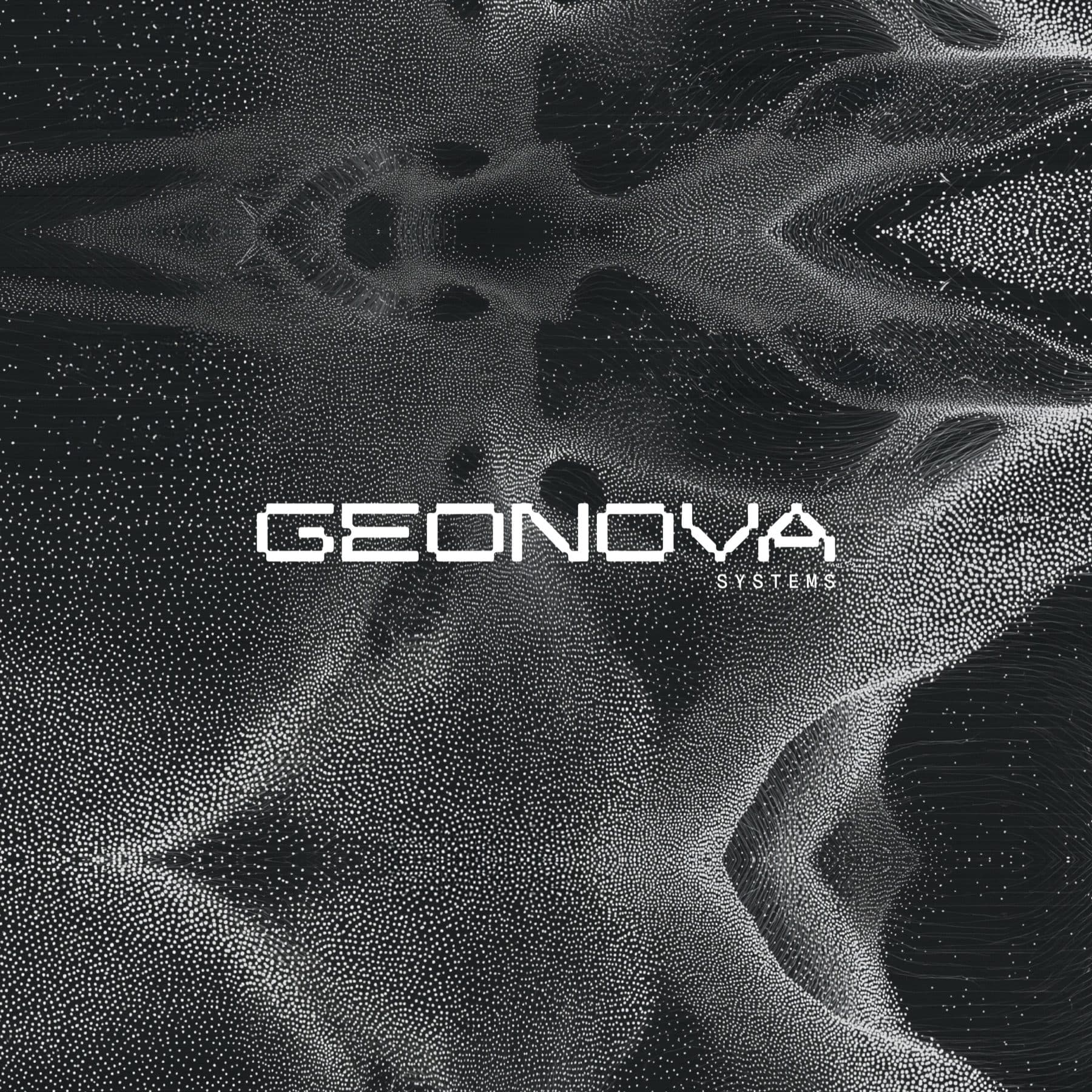
A wave of white points on a black ground, like a scanned landscape, with the word GEONOVA SYSTEMS in white capitals across the centre.

VC & Startups · Launch

Geonova

A wordmark, a point-cloud image language and field art direction for a San Francisco geospatial intelligence platform.

View Case Study

Ready For The Next Stage?

Tell us where the business is and where you want it to go. The Growth Assessment is a short application, then a working session with the founders on what to build first.

  • For Businesses Planning Their Next Stage Of Growth
  • ≈ 2 Min Application
Book a Growth Assessment