Case Study

Kaparti

Kaparti makes jewelry by hand in Bangkok. We built its identity: logo, custom typography, colour system, packaging and guidelines.
Client
Kaparti
Industry
Fashion
Stage
Launch
Location
Bangkok, Thailand
Years
2024
Built
Identity · Typography · Packaging
Website
[ Visit Website → ]
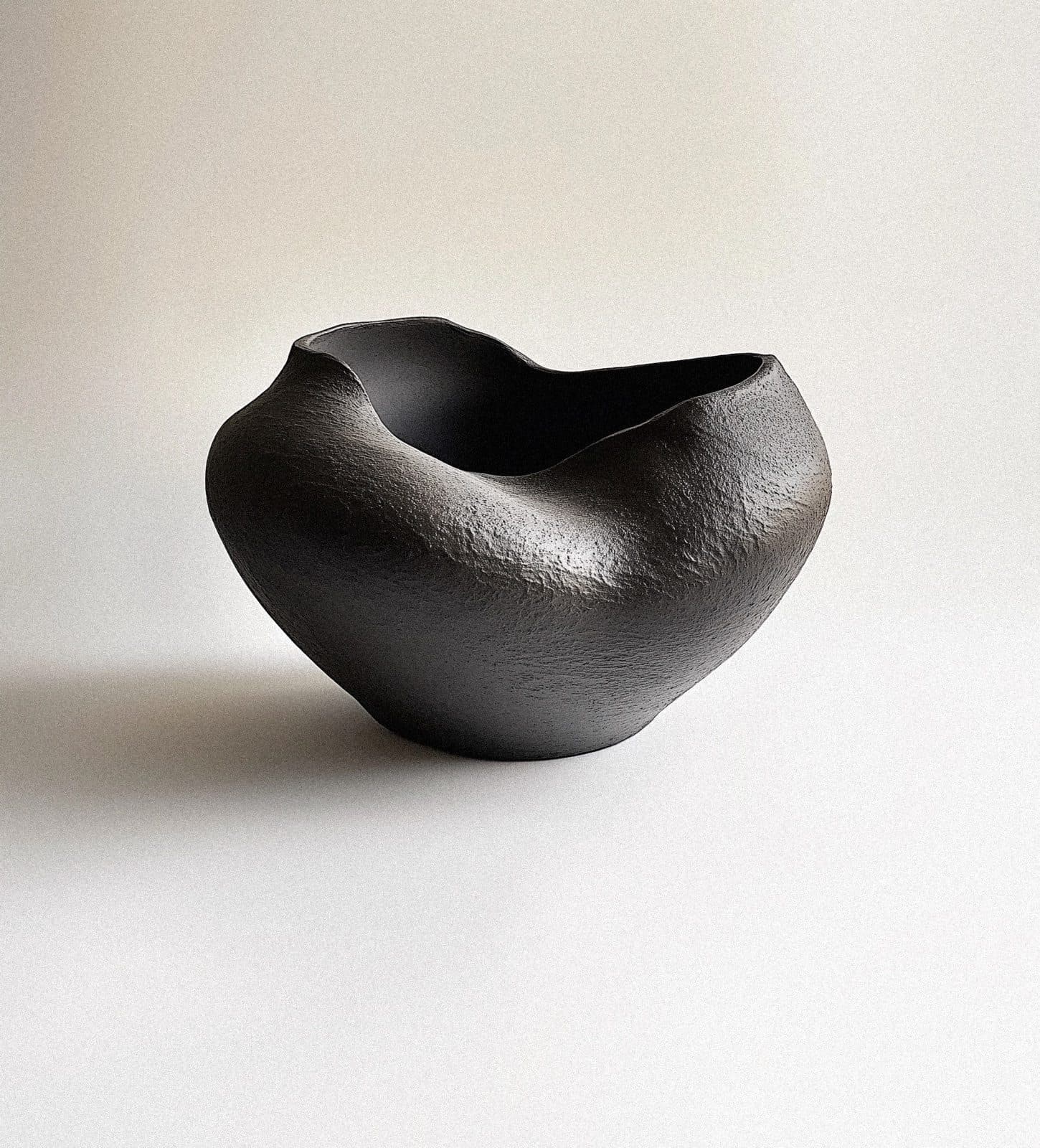
A dark, rough-textured ceramic bowl with a wavy rim on a pale ground, in soft light.

01 · The Result

A Warm, TactileIdentity.

The identity reads as warm and authentic. Earthy tones and textile references sit beside elegant typography, so the brand feels handmade and still looks refined.
  • A hand holds a sand-coloured ceramic pitcher with a looped handle, in soft window light.
  • A seam of black stitches runs down a cracked, blue-grey surface.
  • A woman seen from behind, in black and white, with long wet hair and a thin silver chain at her neck.
  • A linen apron with one pocket hangs from a sash window in a white brick room.

02 · What They Asked For

Jewelry Made By Hand,For Moments Together.

Kaparti is a sustainable jewelry brand based in Bangkok. Each piece is handmade by artisans in the tradition of Thai craftsmanship, with environmentally conscious practices and sustainable materials. The brand builds its pieces around the moments when people come together.
The scope was the full visual identity. It covered a logo, custom typography, a colour system, packaging design and brand guidelines built to carry across physical and digital touchpoints.

03 · What We Built, In Order

Identity, Type AndPackaging.

The work covered the full visual identity, from the mark to the box, with a colour system and guidelines to hold it together.
  1. 01

    Logo

    A black K mark made of two angled bars on a pale grey ground.

    A logo drawn as a wordmark and a compact K mark.

  2. 02

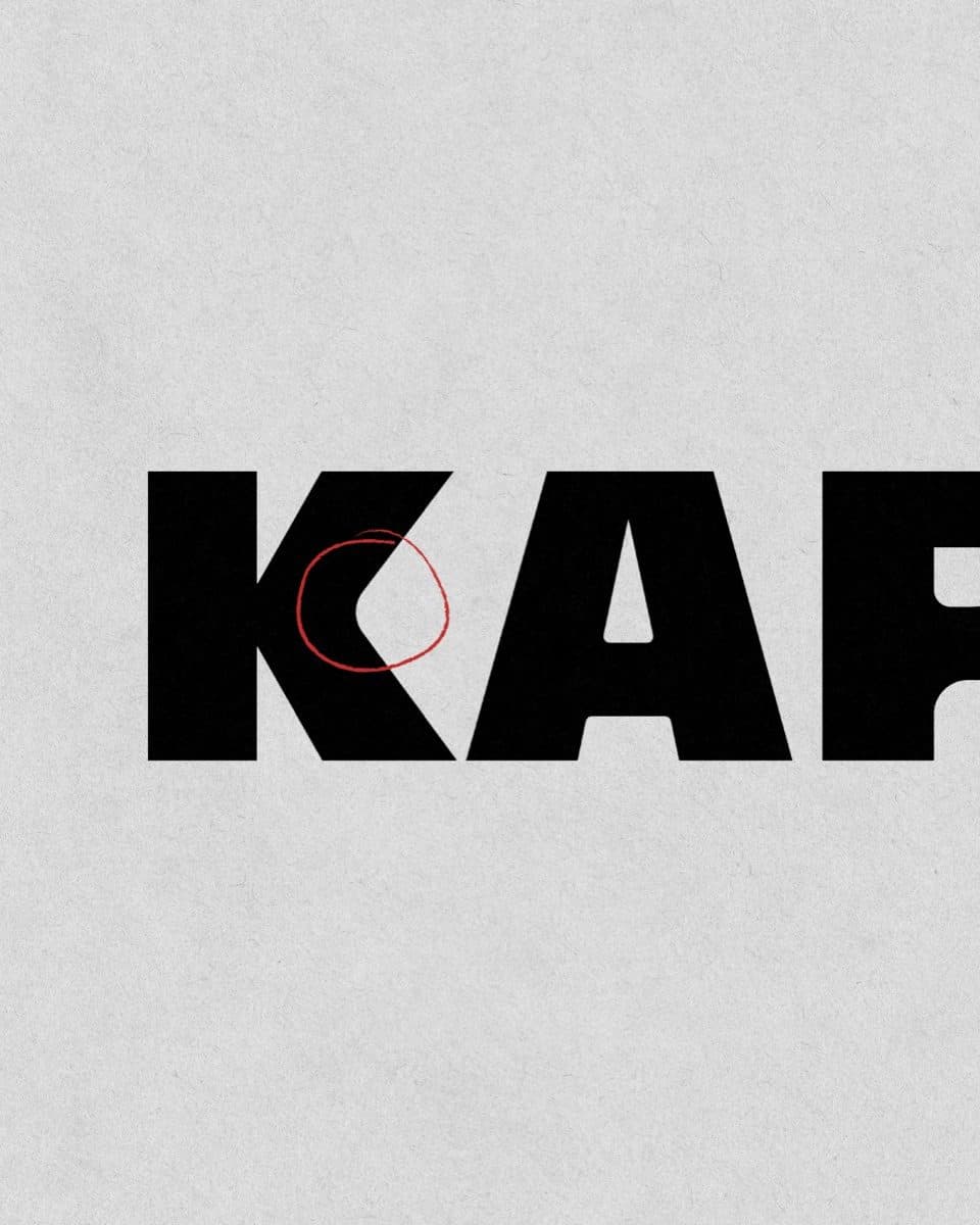
    Custom Typography

    Large black letters spelling Kaparti on grey paper, cropped at the right edge, with a thin red circle drawn on the K.

    Custom typography that keeps the brand elegant next to its earthy tones.

  3. 03

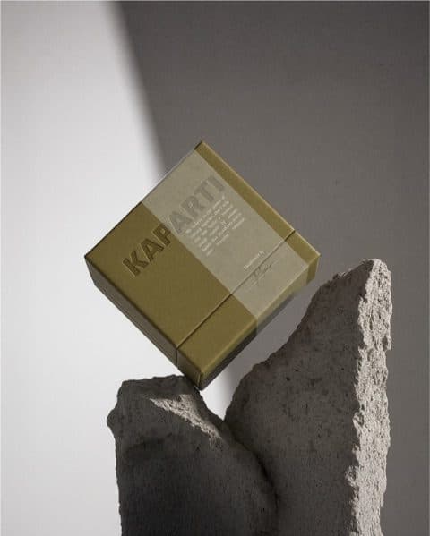
    Packaging

    A khaki and cream Kaparti box balanced on two pieces of rough grey stone.

    Packaging design in khaki and cream, with the name set on the box.
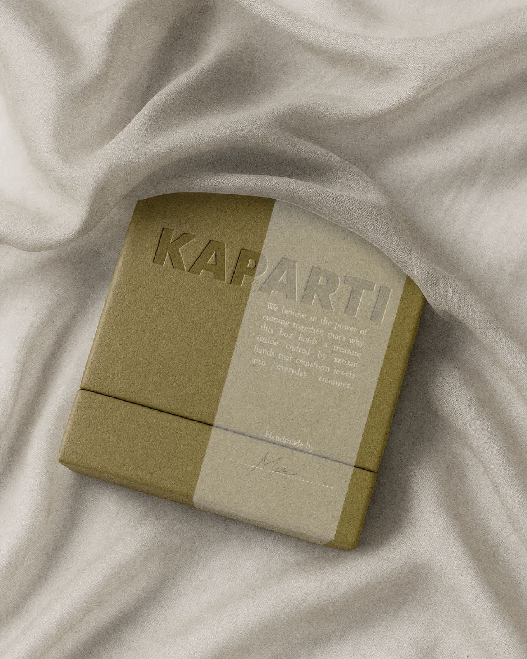
Creased cream fabric with the corner of a khaki Kaparti box below.

04 · The One Decision

Earthy Tones, TextileReferences.

The palette comes from the materials. Earthy tones and natural textile references echo the brand's sustainable practice and its artisan craft, and elegant typography sits over them.

05 · What This Taught Us

Let The MaterialsSet The Tone.

Kaparti's story is handmade, sustainable and rooted in Thai craft. The identity takes its tone from those materials: earthy colour, textile texture and a careful typeface.
When a product is made by hand, the brand should look as if it was too. Warmth comes from what the brand chooses to show, and from what it leaves out.
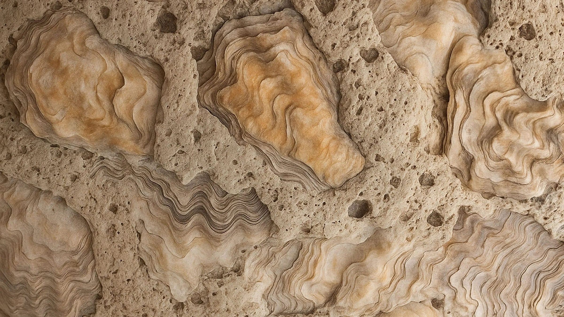
Oyster shells set into a sandy, porous surface, in orange, cream and brown tones.

Furniture & Object Design · Launch

Matter Forms

A London design collective turns oyster shell waste into a concrete alternative. We built the brand and the website.

View Case Study

Ready For The Next Stage?

Tell us where the business is and where you want it to go. The Growth Assessment is a short application, then a working session with the founders on what to build first.

  • For Businesses Planning Their Next Stage Of Growth
  • ≈ 2 Min Application
Book a Growth Assessment